Project: V.I.Seat concierge landing page redesign
overview
V.I.Seat Concierge is a start-up that focuses on modernizing the food ordering and delivery process for university dining halls and stadiums. The service provided is a "to dorm" or "in seat" delivery service for students and sports fans respectively. | Link to Live Website | Link to Final Documentation

Client
V.I.Seat Concierge
Role
UX Designer + Researcher
Visual Design Consultant
Deliverables
Research Insights
Landing Page Redesign
Project Documentation
Duration
April 2020 - July 2020
11 weeks
project goal
V.I.Seat reached out to me to restructure their company landing page using UX design principles and strategy as well as visual design skills to help attract potential investors and clients. They felt that their original landing page lacked the originality and excitement necessary to compete with similar companies. With this redesign V.I.Seat requested that I maintain the original one-page scroll format to keep things simple and straight forward.
Research
nielsen & norman: aesthetic & minimalist heuristic
To help myself gain a better understanding of the original landing pages functionality, usability, and digital inventory, I originally set out to complete a full heuristic evaluation using Nielsen and Norman's 10 usability heuristics. Due to the landing page's non-complex nature, many of the heuristics had little value aside from heuristic #8: Aesthetic and Minimalist Design. This heuristic was made to address the relevance of information on a webpage and whether or not it supports or distracts from the goal of the webpage. I used this heuristic to analyze each section of the page. During this analysis, I also made rated how visually engaging each section of the landing page was.
comparative Analysis
I completed a comparative analysis against tools with similar purposes and functions to gain a better understanding of how other products that function similarly showcase their technology's ability and company brand.
research insights
After analyzing the competitor company landing pages, I was able to identify the following trends in our competitor’s site infrastructure.

Although the branding and aesthetic for each section on each landing page differs depending on the competitor, these four main categories were consistent across the board. So how did V.I.S line up?

In addition to the findings above, I was also able to identify other sections that VIS employs on their landing page and assess the value based on the inclusion or lack of inclusion of these sections on competitor landing pages. The additional pages included:
-
Technology
-
Application Preview
-
About Us
-
Contact Us
Ideation
In the ideation phase, I moved forward using insights gathered from my research, as well as personal requests from leadership at V.ISeat to begin sketching possible redesign ideas. From these sketches, leadership handpicked ideas upon which they wanted further iteration in the form of wireframes.
sketches


wireframes


Final Design
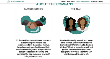
Because they already host their domain on Wix.com, I was able to go in and make a copy of the original website to build out the redesign in. The redesign uses colors and fonts directly from V.I.Seat's company style guide. I also created flat illustrations as an asset for the redesigned "About" section to assist in strengthening the company brand.
Header
original

redesign

benefits


Reinforce


footer

